Choosing an appropriate color means a lot. Color is something that defines your dream, your preferences, your liking, or many more things. You know the colors matter. It helps you to connect with the people, and now you can able to understand the priority of colors in selecting the brands.
That’s the reason the brands select their logo color with consciousness. The blue color has symbolized the sea and the sky. The colors also represent freedom, open spaces, imagination, intuition, inspiration, sensitivity, and expansiveness. The color also holds trust, depth, sincerity, intelligence wisdom, loyalty, heaven, faith, confidence, and stability.
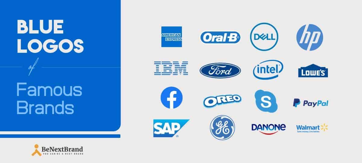
Blue Color logos of popular Brands
Are you confused about the color selection of your brand? Maybe you are not able to determine what will be best for your brand. Well, we will guide you. Even a larger segment of the Americas believes that the color blue is their best color.
Many prominent brands have selected blue as their logo. In this article, we will decide to discuss all the color values of the brands.
American Express:
Being an internationally recognized institution, American Express provides service in the whole world. The company offers travel, payment, and expense. They provide management solutions to individuals as well as businesses irrespective of their size.
Besides that, American Express has millions of satisfied clients in the whole world. The blue color portrays the company’s customer friendliness which is related to the inner meaning of the blue color.
Dell:
Blue colored dell logo portrays the style of elegance. The logo is the primary visual to attract customers from the whole world. The organization selected the blue-colored logo to embody the organizational uniqueness.
It also enhances the driving intent of buying computers impulsively. The organization selected a blue-colored logo as same the color blue; the product looks alluring and amazing.
Facebook:
Why is the Facebook logo in blue color? You may have a question. Well, we must say that Facebook is a company that connects people. A connection is always built in a friendship with many people.
On the other hand, we know that the blue color represents the bond of the relationship. Therefore when we add the virtues of the color blue and the social media platform, we can easily recognize why the company has selected the blue color to design its logo.
Ford:
Management of Ford has designed the logo with shades of blue and white color. Their logo shows the quality and capability of the organization.
Ford’s logo signifies the professionalism and activeness of the particular brand. Also, it builds a sense of security among their customers.
Hewlett–Packard:
Having a Blue logo means a lot. Hewlett-Packard is also having an adorable blue logo. The logo is designed on the demand base of the customers. But why the Blue logo? The answer is that blue is the symbol of trustworthiness.
In addition to that that the blue color associates the locality and reliability. That’s the reason why many Government organizations also use color in their organizations.
IBM:
Just as the nation’s logo identifies the culture, unique and distinct characteristics as same as the brand logo are merely some letters or characteristics. It is more than that. The brand symbolizes the ethics and the characteristics of the company.
IBM is one of the most ethically strong companies, which selects blue as the color of the brand as blue color signifies the ethics and morality of the company.
Lowe’s:
Lowe’s: is also one of the top brands that go for the Blue color logo. The reason behind selecting the blue color represents sensibility, inspiration, and sincerity. Lawless is a company that serves its customer’s service with maximum sincerity.
The company binds the capacity of authorization among the customers. Moreover, the company is able to increase the inspiration and need of the day-to-day to primary care needs.
Oral-B:
Oral B is a facial care company that provides a safeguard against oral infections. Surprisingly, they have selected a blue to color the mouth cleaning items, such as a toothbrush.
According to the many product analysis, the company only selects the brand as blue is the symbol of security, and the company provides oral care or the security of refreshing the mouth. When it comes to the matter of symbolization of blue, there is no substitute for the blue color.
Oreo:
Oreo is by far a company that serves special biscuits, cakes, and chocolates to the people. It wafers the crème in the biscuit. One of the most famous biscuits in the US market, it gave tremendous fun to the people.
The people who share their compatibilities among them and sit together. At the time of the hangout, they sit together and bite the Oreo biscuits. Thus the biscuits increase the bond and the friendship between both of them.
PayPal:
The blue color is a symbol of transparency. And PayPal enhances transparency. The main motto of the pay pal to send money and accept money payments in a transparent way.
Therefore when they decide to go the blue, it seems that it has a valid reason. Both the platform of PayPal and the blue color are linked with each other by their virtue.
Pepsi:
Pepsi basically a food and beverage company that serves soft drinks to consumers. Over the years, people loved the product because of its Uniqueness to taste.
Pepsi selects Blue color as its brand color because the color is the symbol of bond unity and power. Here to mention the brand Pepsi also gives importance to making the bond, unity, power, and many other things.
Skype:
Skype is telecommunication that enables people to chat, talk and communicate through the medium of the computer. It is one of the premier tools for making relationships in the form of video.
Moreover, this is a tool that gives the opportunity to connect with people whoever staying in a distant place. So basically, the main motto of the tool is to connect the people. Even the Color blue also represents communication, pervasiveness, and attachment. Synchronization of both color aspects and the company goal is quite meaningful as it holds a similar type of meaning.
Walmart:
Walmart is often known King of retail. Walmart has many successes story on the whole. For many decades the brand has developed its profit vertically by serving consumers worldwide.
Even stiff competition even can’t decrease the consumer base of the company. Walmart is a symbol of royalty, elegance, and loyalty. Especially, consumers do believe that conception. Similarly, the blue color renders the same level of royalty and sophistication.
BMW:
The classic inheritance and the sophistication are the top-notch plus points of the Vehicle company BMW. This is the reason why BMW has a strong base of amazing users in the whole world. Even the craze of the BMW is just unimaginable. The organization designed the logo with the color blue, as the blue color also contributes the same benefits.
Intel:
Intel is a US-based information technology company that brought a drastic change in society to develop information technology. Intel selects the blue color to design its logo.
One of the major reasons behind the selection of blue color is that the color has a very powerful customer base and is the most popular color in the whole US. Moreover, the color’s elegances attract the customer. Therefore companies like Intel are selecting the blue color for their promotion.
SAP:
SAP is a very unique invention of modern technology. The tool offers the solution for the strategic maintenance of human resources and the ERP service.
At the starting period of the SAP, it was not so popular. Therefore they decided to proceed with the options that may help them to make their brand popular in the whole world. In the meantime, the blue color has a very wide expectancy and popularity. While by selecting the color blue, they tried to apply the popularity of blue color on their brand strengthening.
Siemens:
“The blue’- has its own power. The color has a combination of the style and essence of globally accepted recognition. Siemens wants to catch the tag or go global. That’s the reason they decided to go with a global color; they want to make a strong base of consumers around the world. The blue color contains global recognition. Even a small company can look branded if they select the color blue.
DANONE:
DANONE believes in the belief,’ one planet, one health.’ Which means a planet with healthy people. Their motto says that the organization believes in the greatness of the vast earth. Indeed, in the same way, the color blue has an oceanic relevance. Perhaps this is the reason this well-known organization decides to proceed with blue.
The color blue depicts its greatness, and the color is a formal exterior appeal. This is the prime reason why many premier brands select the color’ blue’.
Carl Zeiss AG:
Based in Germany, Carl Zeiss AG is a global pioneer in optical systems. The logo of the optical major is on a blue background which looks like the cross-sectional view of an optical lens. The word “ Zeiss” in bold and white lettering is placed in the center aligned position against the blue background.
General Electric:
Founded by Thomas Edison in 1892, the Boston-based transnational is a pioneer in the power industry worldwide. The logo is instantly recognizable amongst the electrical fraternity. Developed by Michael Abbink, it is circular with blue background and blue and white respective casing. Blue is symbolic of reliability, lawlessness, and brilliance, which is the company’s motto and policy.
KLM Royal Dutch airlines:
The Amsterdam-based airline is the national carrier of the Netherlands. Being one of the oldest airlines still operating, the icon of a crown is placed just on top of the KLM branding. Both the crown and the KLM branding are in blue, signifying the sky, which naturally gels with any airline. Since Queen Wilhelmina had awarded the predicate to the carrier, the crown is manifesting the royal connection.
Philips:
The Netherlands-based Philips, incorporated in 1891, is a global pioneer in consumer electronics and one of the largest electronics manufacturers internationally. The two blue waves in the middle of the logo indicate radio transmission, as the company was the first to do so. The circle exemplifies the earth, which is the broad spectrum of Philips’ operation area.
Nokia:
The foremost name that comes to anybody’s mind when one thinks of mobile sets, Helsinki-based Nokia was incorporated in 1865. The company logo is very simple and clear-cut with excellent branding. The background is blue with Nokia in all upper cases and the letterings are bold and white. The logo personifies the brand as very confident.
Samsung:
The tilted blue background oval logo of this South Korean multinational electronics giant is one of the most recognizable logos internationally. Whilst Samsung branding is in all capital letters in white lettering; the tilted blue oval logo portrays commitment to services, reliability of the product, and dependability, which the company swears by.
Tata Sons:
One of the oldest and the most respected business groups in India and Asia, Tata sons, founded in 1868, is now truly a global endeavor. The Tata group logo in blue, which is used in all divisions, stands for the uniqueness and distinctiveness in all aspects of corporate operations that the group is famous for universally.
Twitter:
The San Francisco-based micro-blogging site is today a very important social media vehicle too. The Twitter logo shows the silhouette of a sky-blue-colored bird just ascending on its flight. The bird called Larry is named after a legendary American basketball player who is slightly plumper with an extra wing at the back.
Was this article helpful?
Marketing | Branding | Blogging. These Three Words Describe Me in The Best Way. I Am the founder of Burban Branding and Media, a Self-Taught Marketer with 10 Years of Experience. Helping Startups/ Companies/ and Small Businesses to Enhance Their Business Through Branding and Marketing. On A Mission to Help Small Businesses to Be a Brand.


