In the world of brands and logos, the square shape stands out. It’s like a sign of being steady, balanced, and trustworthy.
Square logos are everywhere, from big tech companies to fashion brands. They are easy to spot and make people remember the brand better.
They also show that a company is professional and quickly shares what it is all about. In this article, we will talk about some of the most famous square logos.
We’ll see why they’re so popular and how they’ve changed. These logos are more than just a picture; they’re crucial to how a brand talks to us.
Let’s dive into the stories of these square logos and find out why we love them so much! 😊🔲📈
The Psychology Behind Square Logos
The psychology behind square logos is deeply rooted in the principles of shape psychology, which explores how different shapes can influence perception and behavior. Square logos, due to their geometric precision, convey several psychological attributes:
Feeling Grounded
There’s something incredibly grounding about a square logo. It’s like the visual equivalent of a firm handshake – it immediately communicates that you’re dealing with a solid, dependable entity.
Squares symbolize stability; it’s as if they’re saying, “We’ve got a strong foundation, and we’re not going anywhere.”
A Mark of Professionalism
When I see a square logo, I think of sharpness, clarity, and a business that’s got its act together.
The clean lines and right angles suggest a level of professionalism and precision that’s reassuring. It’s a subtle hint that they pay attention to the details and value efficiency.
Equality and Fairness
The equal sides of a square speak volumes about balance and fairness. This shape doesn’t lean in any direction; it’s neutral, impartial, and equitable.
For organizations that want to highlight their commitment to fairness and equal treatment, a square logo is a fitting choice.
The Comfort of Tradition
There’s a reason squares are a classic choice – they evoke a sense of tradition and reliability.
While they might not be the go-to for brands aiming to scream innovation, they do assure you that the company isn’t new to the game. It’s a nod to established values and a history of consistency.
Simplicity at Its Best
In today’s world, where everything feels increasingly complicated, the simplicity of a square logo is a breath of fresh air.
It suggests a no-frills, straightforward approach to business. This shape tells you that the company is all about getting the job done without any unnecessary complexity.
Cultural Sensitivity
It’s fascinating how a shape can mean different things in different cultures. A square logo isn’t just a design choice; it reflects the brand’s awareness and sensitivity to its audience’s cultural context.
This adaptability can make a square logo resonate more deeply with a specific demographic.
Famous Square Logos
1. BBC
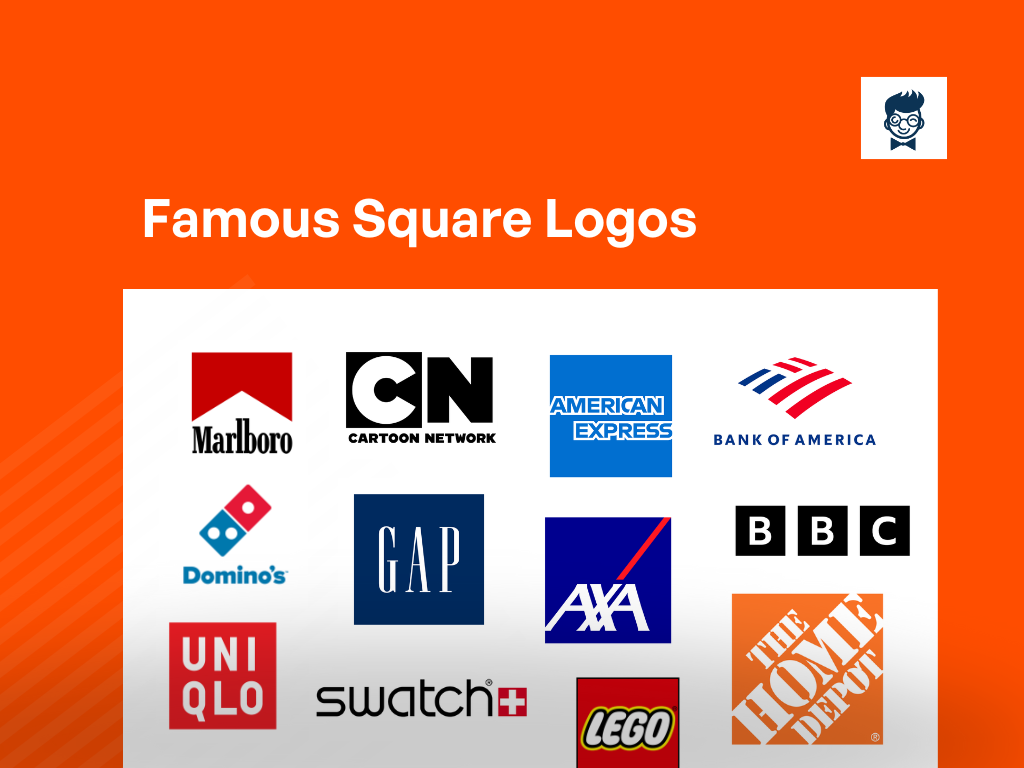
The British Broadcasting Corporation (BBC) logo features a series of three black boxes with white letters.
The design has remained consistent over the years, reflecting the organization’s commitment to clarity and simplicity.
The boxes represent different aspects of media, including television, radio, and online content.
2. Cartoon Network
Cartoon Network’s logo is a colorful, playful design featuring the channel’s initials in a dynamic and creative arrangement.
The vibrant colors and whimsical font capture the essence of the network’s focus on animated and imaginative content for a younger audience.
3. American Express
The American Express logo is a blue square with a white depiction of a centurion on a card. The logo signifies strength, trust, and financial security, aligning with the company’s reputation as a reliable and premium financial services provider.
4. Dominos Pizza
Dominos Pizza’s logo is a red square with three dots forming a domino tile. The simplicity and boldness of the design reflect the brand’s focus on quick and efficient pizza delivery, while the domino reinforces the company’s name.
5. UniqLo
UniqLo’s logo consists of red squares arranged in a grid, representing the brand’s commitment to simplicity and functionality in its clothing designs.
The red color symbolizes passion and energy, aligning with the brand’s dynamic and contemporary image.
6. GAP
GAP’s logo is a blue square with the brand’s name in white uppercase letters.
The simplicity and clean lines of the design reflect the company’s dedication to classic, timeless fashion, while the blue color conveys a sense of trust and reliability.
7. Swatch
Swatch’s logo is a square with colorful sections, representing the brand’s playful and innovative approach to watch design.
The various colors symbolize the diversity and creativity found in Swatch’s extensive collection of timepieces.
8. AXA
AXA’s logo is a blue and red square divided diagonally, conveying stability and trust.
The two colors represent the diverse range of services offered by the multinational insurance company.
9. T-Mobile
T-Mobile’s logo features a magenta square with a stylized “T” in white. The vibrant magenta color represents the brand’s bold and disruptive approach in the telecommunications industry.
10. Lego
The Lego logo is a red square with the word “LEGO” in white.
The simplicity of the design reflects the iconic and timeless nature of Lego bricks, while the bold red color symbolizes creativity and fun.
11. 7-Eleven
The 7-Eleven logo is an orange, green, and red square with the brand’s name and a number “7” in white.
The bright colors and clear design evoke a sense of convenience and accessibility, emphasizing the 24/7 nature of their stores.
12. Facebook
Facebook’s logo is a blue square with the letter “F” in white. The clean and recognizable design reflects the social media giant’s commitment to simplicity and connectivity.
13. LinkedIn
LinkedIn’s logo is a blue square with the brand’s name in white. The professional and straightforward design aligns with the platform’s focus on connecting and networking within the business community.
14. Bank of America
Bank of America’s logo is a blue square with a red and white striped flag design. The imagery symbolizes the bank’s patriotic roots and its commitment to financial strength and stability.
15. The Home Depot
The Home Depot’s logo is an orange square with the brand’s name in white. The bold color and simple design convey a sense of warmth and reliability, reflecting the company’s focus on home improvement and construction.
16. The weather channel
The Weather Channel’s logo is a blue square with a white cloud and sun. The straightforward design reflects the channel’s dedication to providing accurate and timely weather information.
17. The Goldman Sachs
Goldman Sachs’ logo is a black square with the brand’s name in white. The sleek and modern design represents the financial firm’s commitment to innovation and excellence in finance.
18. AVG
AVG’s logo is a green square with a white checkmark, symbolizing security and protection.
The simple and clear design reflects AVG’s focus on antivirus and cybersecurity solutions.
19. Adobe
Adobe’s logo is a red square with a white letter “A.” The clean and minimalist design reflects Adobe’s role as a leading software company, known for its creative tools.
20. YouTube
YouTube’s logo is a red play button inside a white square. The simplicity and boldness of the design represent the platform’s focus on video content and user-friendly interface.
21. Formula 1
The Formula 1 logo is a black square with a stylized “F1” in white. The sleek and dynamic design captures the high-speed and cutting-edge nature of Formula 1 racing.
22. National Geographic
National Geographic’s logo is a yellow square with a stylized depiction of the Earth in the center.
The iconic design reflects the brand’s dedication to exploration, science, and storytelling.
23. Instagram
Instagram’s logo is a colorful gradient square with a camera icon in the center. The vibrant colors and simple design convey the platform’s focus on visual storytelling and sharing.
24. Ritter Sports
Ritter Sports’ logo is a white square with the brand’s name and a colorful depiction of a mountain.
The imagery reflects the brand’s association with high-quality chocolate, and the colorful mountain symbolizes the variety of flavors.
25. Visa
Visa’s logo is a blue square with a gold and white depiction of the brand name. The combination of colors and clean design reflects the financial company’s global reach and trustworthiness.
26. Nestle
Nestle’s logo is a blue square with a white depiction of a mother bird feeding her chicks.
The imagery reflects the company’s commitment to nurturing and nourishing through its wide range of food and beverage products.
27. Marlboro
Marlboro’s logo is a red square with a white cowboy hat and a red ribbon underneath. The iconic design is synonymous with Marlboro’s rugged and masculine image in the tobacco industry.
28. GM- General Motors
General Motors’ logo is a blue square with the brand’s initials in white. The straightforward design reflects GM’s position as a leading automotive manufacturer with a long history in the industry.
29. Microsoft
Microsoft’s logo is a four-color square with the brand’s name and a window icon. The design represents the company’s diverse range of products and services, emphasizing innovation and connectivity.
Was this article helpful?
Marketing | Branding | Blogging. These Three Words Describe Me in The Best Way. I Am the founder of Burban Branding and Media, a Self-Taught Marketer with 10 Years of Experience. Helping Startups/ Companies/ and Small Businesses to Enhance Their Business Through Branding and Marketing. On A Mission to Help Small Businesses to Be a Brand.


