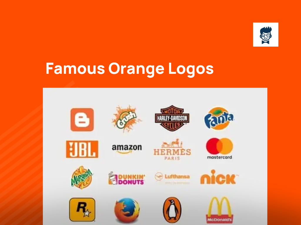
In the exciting world of branding, the color 🟠 orange shines bright, symbolizing ✨ energy, enthusiasm, and creativity.
As we explore the world of company identity, it’s clear that lots of famous brands picked warm and lively orange shades for their logos.
From big tech companies to your favorite drink brands, orange is used everywhere, making a lasting impression on people’s minds.
Come along on a colorful adventure with us as we discover the importance and influence of famous orange logos, uncovering the stories behind these bold and eye-catching symbols.
Orange Logos of Famous Brands
Many leading brands of the world have used orange as their primary color in their respective logos.
Because of the stimulating specialties and characteristics of the orange color, such as energy, happiness, and warmth, most successful food giants and leading companies in their respective sectors have been using the orange color in their logos.
Amazon:
The Seattle, Washington-based transnational corporation is one of the biggest e-commerce, consumer electronics, and digital distribution companies worldwide.
The orange logo designed by Anthony Biles conveys a friendly smile and that of consumer satisfaction and, on the other hand, drives home the point that it sells anything and everything under the sun from A to Z.
Blogger:
Blogger is a blog host or blog-publishing service available in 60 main languages of the earth.
Since the orange color denotes creativity, energy, enthusiasm, and youthfulness, it goes very well and in perfect sync with the Blogger logo as this is also a forum for free expression.
Crush:
Currently owned by the Texas-based Keurig Dr. Pepper, Crush is an extremely popular caffeine-free brand of carbonated soft drinks that is trendy globally.
The brand was known as Orange Crush, as the item was initially created as a sort of orange soda.
Apart from the orange flavor, Crush is available in many other flavors like grapes, strawberry, peach, pineapple, and diet orange.
As a part of a novel strategy, Crush has stuck to the Orange color in its logo design further to reinforce brand awareness in the consumer’s mind.
Dunkin Donuts:
1950 incorporated Massachusetts-based organization is a transnational coffee house and a donut marketer and one of the most reputed in the world.
Since the inception of the logo, the color scheme has been brown and yellow. In 1961, a revised logo was designed with the branding of Dunkin in orange and donuts in pink.
Bright orange was added in 1980 in place of hot pink. The current logo was recreated in 2014 with slight moderation, keeping the basic color scheme the same.
DUNKIN is in bright orange, keeping the branding very loud and clear, with Donut in pink.
Fanta:
Although originating in Germany and Italy 80 years back, the fruit-flavored carbonated drinks are produced by Coca-Cola. Fanta is a direct competitor to Mirinda, Slice, and Crush.
It is an orange-flavored soda drink and has been projected as a fun-filled, bubbly brand. The typeface and font style targets the younger audience, and the product is positioned for them only.
The circular orange background represents an outline of an orange with a beautiful motif of an orange leaf, making it a lovely, appetizing contrast.
Harley Davidson:
Founded in 1903 and based at Wisconsin, Harley Davidson is one of the premium motorcycle brands of the world. The logo is one of the most recognizable brands in the automotive sector.
The orange element in the logo denotes vigor, exuberance, bustle, and action, truly representing a motorbike, while black resembles sophistication.
Since black is the ground color, the name branding must be in white so that the company name stands out very clearly.
Hermes Paris:
The Paris-based organization was founded 183 years ago is in the retail industry and marketing perfumes, jewelry, leather goods, and other high fashion and luxury items.
The logo color is bright orange, which was created during the 1950s.
The logo shows a stylized horse-drawn carriage with a coachman in front, presumably drawn from the fact that the company initially manufactured horse saddles.
The bright orange color resembles the genuineness and distinctive edge of the company from its competitors.
The unique and distinguishing characteristics of the brand, as visualized in orange color, are also established herewith.
JBL:
This Los Angeles-based company, which was founded in 1946, is in the business of producing and marketing audio equipment, loudspeakers, and headphones. JBL is the abbreviation of the founder’s company name.
The logo was initially designed by Mr. Jerome Gould, who designed the Pepsi logo.
That was a black and white one. Later on, the president of the company himself changed the logo. The refurbished logo was placed inside a box so that the abbreviations JBL were clearly visible.
The ground color of the box is bright orange, with the brand lettering white. The color orange represents self-reliance and power.
Bitcoin:
MasterCard:
The NewYork-based multinational corporation has been firmly ensconced in the global financial and credit card, debit card, and prepaid cards market since 1966.
The MasterCard logo is very much recognizable because of its striking orange color and currently is without the name branding.
The two interlocking circles of orange and red had the word MasterCard written at the base in black previously.
With the new complete digitalization in all spheres of activities, the orange and red interlocking circles alone without name branding will suffice as the company feels.
Mirinda:
Mirinda is a citrus-flavored soft drink, primarily orange, from the PepsiCo stable and originated in Spain in 1959.
Apart from orange, the drink is available in other fruit flavors like apple, strawberry, raspberry, pomegranate, etc.
As the flagship brand is orange-flavored, the company logo has also been designed so that the entire background is orange, and the branding name, the motif over I, and the green band resemble the green hue of an orange leaf.
The orange splash just behind the brand name expresses joy and satisfaction after taking the drink.
Mozilla Firefox:
Developed by Mozilla Foundation, the free and open-source web browser is commonly known as Firefox.
The initial release was in 2002, and very recently, the standard release was done early this month.
The initial logo was the illustration of a phoenix bird in red color. In 2003, the Firefox logo with the earth encircling was launched, symbolizing the browser’s global reach at lightning speed. Orange was the predominant color in the illustration of the fox.
As this logo clicked, Firefox did some brush-ups on the logo where the orange and red areas were increased on the fox’s body.
Nickelodeon :
Owned by Viacom CBS, the New York-based TV channel Nick or Nickelodeon is the first cable channel entirely dedicated to children.Nick.com.
Does the channel develop a website? Orange is the color of youth, vibrancy, freshness, activity, and joy.
Since children are the primary target audience of the channel and website, the orange color truly resonates with the target group.
The latest logo personification is bubbling with full of joy, and attractiveness and stands out in the crowd because of its glossier and superior finish.
Orange:
Primarily known as Orange S.A. and rechristened from France Telecom S.A., the company is a French multinational company in the telecom sector.
The brand orange has been used in its mobile, landline, IPTV, and internet service. The logo is a square box in solid orange color with the orange branding in white lettering at the base of the box.
Penguin Books:
The British organization, founded in 1935, is one of the most reputed publishers around the globe. The logo of an image of a penguin inside a vertical orange oval shape is one of the most recognizable logos till today.
This penguin is lovingly called Tux, and the design was created in 1935 with a simple single-color logo of the image of a penguin.
The current design was created in 2002 after lots of fine-tuning previously. The publishing house describes its current logo as well as dignified but frivolous.
Shell:
The Anglo-Dutch Petroleum Company, headquartered in The Netherlands, is considered one of the supermajors of the oil industry internationally.
“Shell” initially debuted in 1891 as a symbol for kerosene being transhipped to the Far East.
Kerosene found its way to India to be sold; around 1904, based on the shape of a Pecten sea shell, the current logo was incorporated, giving it a visual entity.
Initially, the logo color was red and yellow, keeping in mind to befriend Spanish settlers in California, but later on, orange was chosen in the 1970s.
WNBA:
The US-based Women’s National Basketball Association, known as WNBA, was commissioned in 1997.
Based in New York, it has 12 teams playing. The logo in orange is based on the NBA logo, where a player is shown doing a layup.
Initially, the player silhouette of a woman was inside the box, but later on, to give more space to the image, the box was removed. The Orange in the logo denotes youth and vigor.
HTML5:
Developed by the World Wide Web Consortium, HTML 5 is an open-format markup language and the latest version of HTML.
The logo is 100% orange and placed in a regular pentagon-type box with 5 in white, very boldly written in the middle, with the orange ground.
The four letters of HTML are in solid black on top of the orange pentagon.
The logo depicts the language as bold, bright, forward-thinking, and striving for progress, which it tries to convey and reinforce in the minds of the web developers.
Hooters:
Based in Atlanta and Florida, this is the trademark of two adult restaurant chains in the USA. The logo in 100% orange shows an owl universally known for its calls known as hooting.
The Hooters branding is in solid orange color whereas the “oo” in the word Hooters is two solid thicker circles with dots in the middle in the white ground, also circles.
Payless ShoeSource:
The Texas-based international discount footwear chain operates in 3500 + outlets globally. Until 2006, the brand logo was in yellow, and the smaller cases of “shoe” and “source” were Bright red circles.
The current logo is in solid orange color, a new try to rebrand and reposition the organization. The effort has been to give a more contemporary and stylized image of the company.
The word Payless is in a bigger point size than ShoeSource, which is in the next line underneath” Less “.The stylized P is in a circle, denoting movement and transformation.
Gulf:
The Pittsburgh-based oil major has been consistently among the top ten oil companies in the USA since its inception.
The logo is round with the word Gulf written in customer-friendly typeface, and the orange glow behind the branding is a darker vignette of the classic Gulf color.
The company wants to promote this retail fuel image in the minds of the consumers.
Science Channel:
Launched in October 1996 in the USA, Discovery Inc. owns Science Channel, and its content has been science and technology, UFOlogy, wilderness, animal survival, etc.
The logo featured Sc in upper and lower cases, respectively, with an orange box in the background.
The branding of the Science Channel is at the bottom in two lines – the word science is in a bigger point size compared to the channel, and both of them are orange.
The logo has since then been changed to blue.
Sony Walkman:
A brand of portable media from the stable of Sony, Walkman was initially a portable cassette player, a huge craze in the 1980s and 1990s. Later on, Sony launched a portable CD player and Discman too.
The initial logo was in a solid orange box with the company pneumonic and Walkman written in white with orange in reverse.
Later on, the color scheme was just interchanged with the pneumonic and Walkman in solid orange in a white box.
Timberland:
Timberland, based in New Hampshire, the USA, has been one of the major manufacturers of footwear, apparel, leatherware, luxury watches, etc.
The logo in orange shows a sturdy, strong orange tree with branches.
The brand name itself suggests that it is a land with woods and trees, shrubs, and mini forest. The logo and the name are thus in perfect sync with each other and the product it markets — a strong pair of shoes for a rugged and rough topography.
TNT:
A subsidiary of the global logistics management pioneer FedEx, TNT is a logistics and courier organization based in the Netherlands.
The TNT orange logo inside three circles is instantly recognizable worldwide.
Orange has been used as the principal color in the logo as the designer feels it is correlated to the people or masses with which the company is knotted.
Inside the three circles, the borders have grey casing so that TNT and the three letters stand out very prominently.
Alibaba Logo
B And Q logo
Bitly Logo
Built Logo
Burger King Logo
Etsy Logo
Gatorade Logo
Gsk Logo
Headspace Logo
ING Logo
Just Eat Logo
Sound Cloud Logo
The Home Depot Logo
More to Read, More to Explore 👇 Articles
Was this article helpful?
Marketing | Branding | Blogging. These Three Words Describe Me in The Best Way. I Am the founder of Burban Branding and Media, a Self-Taught Marketer with 10 Years of Experience. Helping Startups/ Companies/ and Small Businesses to Enhance Their Business Through Branding and Marketing. On A Mission to Help Small Businesses to Be a Brand.


