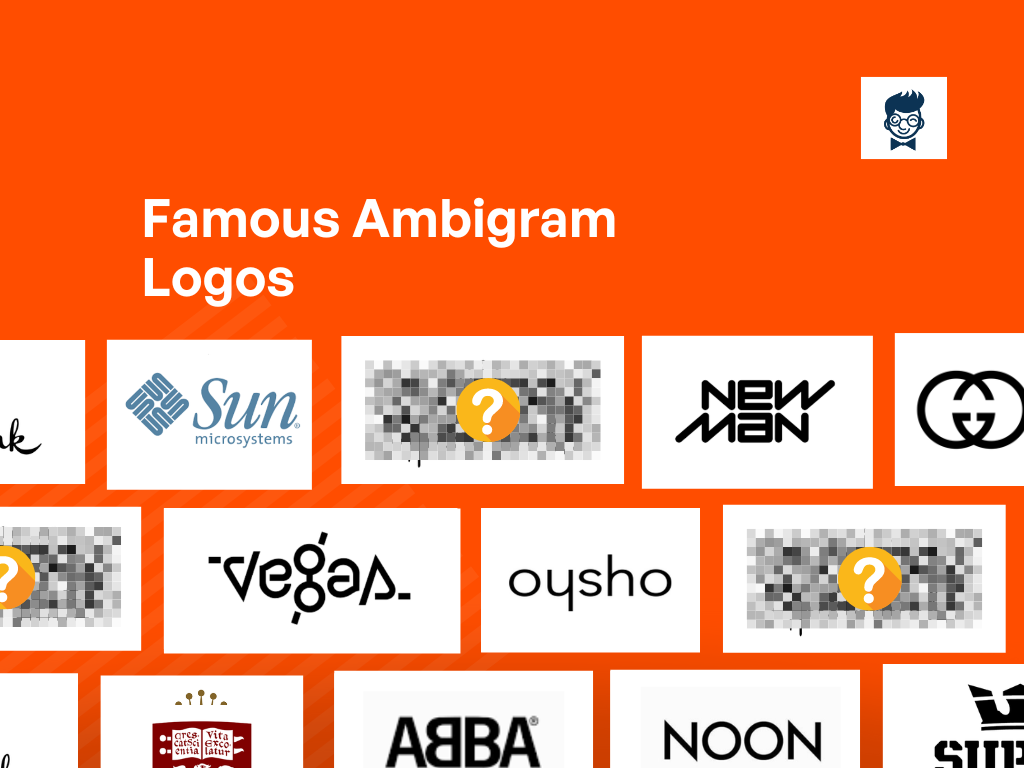
Ever heard of logos that look the same even when you turn them upside down? They’re called ambigram logos, like word puzzles for brands.
Unlike regular logos, these have a sneaky way of staying the same no matter how you look at them.
It’s like magic but for logos! In this journey, we’ll discover what makes these logos so tricky and how they add a sprinkle of fun to a brand’s story.
Get ready for a ride where words have a few surprises up their sleeves, and logos are more than meets the eye!
What is An Ambigram Logo?
An ambigram logo is a unique design that possesses symmetry, allowing it to be read or interpreted from different angles or orientations.
This type of logo is a visual puzzle, showcasing a remarkable ability to convey the same message or word even when flipped, rotated, or mirrored.
The word or symbol retains its meaning regardless of the perspective, making ambigram logos a creative and versatile choice for businesses seeking a distinctive brand identity.
Ambigram logos stand out for their dynamic and interactive nature, engaging viewers with a playful and intriguing visual experience.
Why Ambigram Logos?
Ambigram logos are captivating visual representations that exhibit symmetry, allowing them to be read or interpreted from multiple perspectives.
This unique design approach enhances brand recognition and engagement by conveying a sense of creativity and versatility.
Ambigram logos possess the power to intrigue and leave a lasting impression on viewers, making them an effective and memorable branding choice.
What Does the Ambigram Add to The Identity?
- 1 Versatility: Ambigrams are dynamic and versatile, embodying multiple interpretations and meanings. This flexibility reflects a brand or individual’s adaptability and diverse offerings.
- 1 Symbolism: Depending on the words or symbols used, ambigrams can carry symbolic meanings aligned with core values, mission, or personality traits associated with a particular identity.
- 1 Interaction: Ambigrams invite engagement as people explore the design from different angles. This interactive aspect fosters a connection between the identity and its audience, promoting engagement and interest.
- 1 Mystery and Surprise: Ambigrams introduce mystery and surprise by revealing different words or meanings within the same design. This intrigues individuals to delve deeper into the identity and uncover hidden layers.
- 1 Artistic Expression: As visual art, Ambigrams allow for unique artistic expression when incorporated into an identity. This conveys a commitment to aesthetics, originality, and a desire to communicate visually.
Famous Ambigram Logos
Explore the mesmerizing world of famous ambigram logos, where artistry and design converge to create captivating symbols with dual meanings.
These logos, masterpieces of typographical ingenuity, seamlessly convey different words or messages when viewed from different perspectives.
From renowned brands to iconic symbols, ambigram logos showcase the power of visual illusions, leaving an indelible mark on the intersection of creativity and branding.
Raffles Cafe & Bar
Raffles Cafe & Bar’s logo exudes sophistication with its elegant typography and subtle color palette.
The intertwining letters create a sense of unity, reflecting the venue’s upscale atmosphere. The refined design hints at the establishment’s commitment to a luxurious dining experience.
OXO
Oxo’s emblematic logo embodies simplicity and functionality. It features clean lines forming the brand’s name in bold typography.
The ‘O’ represents innovation, while the ‘x’ denotes versatility. The minimalist design reflects Oxo’s commitment to user-friendly products across diverse markets, from kitchenware to household tools.
Xpedx
Xpedx’s emblem is a fusion of strength and sophistication.
The bold ‘X’ symbolizes power and dynamism, mirroring the company’s role as a leading distributor in the packaging and printing industry.
The sleek, contemporary font choice suggests professionalism and reliability, reflecting Xpedx’s commitment to quality service and innovative solutions.
Sonos
Sonos’ emblematic logo is a blend of modernity and musicality.
The stylized ‘S’ evokes sound waves, symbolizing the brand’s dedication to delivering immersive audio experiences.
Its clean lines and minimalist design reflect Sonos’ commitment to simplicity and innovation in the realm of wireless home audio systems, reinforcing its reputation as a pioneer in the industry.
Flow
Flow’s emblem captures the essence of movement and harmony.
The fluid lines of the logo represent the seamless integration and efficiency of the company’s workflow management solutions.
The circular form embodies continuity and interconnectedness, reflecting Flow’s mission to streamline processes and enhance productivity for businesses across various sectors.
BURNING MAN
Burning Man’s iconic logo epitomizes creativity and community. The fiery lettering evokes the event’s spirit of self-expression and radical inclusion.
The bold, graffiti-inspired font reflects the festival’s counter-cultural roots and celebration of art and individuality.
Its dynamic design embodies the transformative experience of participating in the annual gathering, fostering connections and cultural exchange.
Sun Microsystems
Sun Microsystems’ logo is a timeless representation of simplicity and innovation.
The sleek design, featuring four interleaved “S” letters, reflects the company’s commitment to interconnected systems.
The use of negative space creates a sense of harmony, embodying Sun Microsystems’ dedication to seamless technological solutions.
Elite
Elite’s logo exudes exclusivity and luxury through its minimalist design.
The sleek, uppercase typography and gold accents convey sophistication, aligning with the airline’s focus on premium travel experiences.
The restrained elegance of the logo sets the tone for a high-end and distinguished brand image.
New Man
New Man’s logo is a blend of classic and contemporary design elements.
The bold typography and contrasting colors convey a sense of vitality and modernity, appealing to a diverse audience.
The dynamic logo reflects New Man’s commitment to fashion-forward styles and a vibrant brand identity.
Aerosmith
Aerosmith’s logo is iconic, capturing the spirit of rock ‘n’ roll.
The bold, italicized font and dynamic wings symbolize energy and movement, perfectly aligning with the band’s high-octane music.
The enduring design has become synonymous with the legendary rock band’s identity and has stood the test of time.
Vegas
Vegas’ logo is a dazzling representation of the city’s vibrant entertainment scene.
The use of neon lights and bold typography conveys the excitement and glamour associated with Las Vegas.
The dynamic design captures the essence of the city’s nightlife, making it a fitting symbol for a destination-focused airline.
Handy Instant Booking
Handy Instant Booking’s logo is user-friendly and approachable. The combination of a hand icon and a clock conveys speed and efficiency in booking services.
The cheerful color palette enhances the friendly and accessible nature of the brand, making it a visually appealing choice for travelers seeking hassle-free arrangements
Oysho
Oysho’s logo reflects the brand’s emphasis on femininity and elegance.
The cursive typography and delicate color palette convey a sense of sophistication, resonating with the fashion-conscious audience.
The graceful design captures the essence of Oysho’s commitment to stylish and comfortable travel experiences.
Edge
Edge’s logo is a testament to cutting-edge design and innovation.
The sleek, angular typography and metallic accents convey a sense of modernity and sophistication.
The dynamic design aligns with Edge’s commitment to providing a forward-thinking and technologically advanced travel experience.
Honey
Honey’s logo is sweet and inviting, featuring a playful combination of honeycomb patterns and a charming bee icon.
The warm color palette enhances the brand’s friendly and approachable image, making it an appealing choice for passengers seeking a delightful and enjoyable travel experience.
Noon
Noon’s logo captures the essence of a tranquil and sophisticated travel experience.
The elegant typography and subdued color palette convey a sense of calmness and luxury.
The timeless design reflects Noon’s commitment to providing its passengers a peaceful and comfortable journey.
ABBA
ABBA’s logo is a nostalgic nod to the iconic music group’s legacy.
The bold, capitalized letters with a playful color scheme evoke a sense of the ’70s pop culture. The enduring design pays homage to ABBA’s timeless music, making it a symbol of the band’s enduring popularity and cultural impact.
Was this article helpful?
Marketing | Branding | Blogging. These Three Words Describe Me in The Best Way. I Am the founder of Burban Branding and Media, a Self-Taught Marketer with 10 Years of Experience. Helping Startups/ Companies/ and Small Businesses to Enhance Their Business Through Branding and Marketing. On A Mission to Help Small Businesses to Be a Brand.


